2009年5月29日 星期五

Materiality, Affect, Site(II)


"Rainbow Dance", 1936


Sculpture "Fountain", 1959

Frame from"A Color Box", 1935


Len Lye(1901~1980, Christchurch, New Zealand)

He is known for his experimental films and kinetic sculpture. He was an innovative director who experimented to develop the painting with motion on the film.

Today I have seen his animation film “Rainbow Dance” , 1936.
In the beginning, a dancing man at the form of stenciled figure under the rainbow with the music. And then holding the umbrella and dance under the rain, playing tennis with different motions against a perspective road. There are many lines and patterns with the motions on the screen. It is an animation, a method of painting, scratching and stencilling directly onto motion picture. I think he presented his art form through the film. And “the Medium is the Message”. It’s creative and experimented during the period of 1930.
It’s fun to watch the film although it’s blurred and undistinguished.
When I tried to click the internet to view the film “A Color Box” ,1936, I failed to pass through.
As for his kinetic sculpture, Many of Lye's kinetic works can be found at the Govett-Brewster Gallery in New Plymouth , Taranaki, including a 45-metre high Wind Wand near the sea. The Water Whirler, “The Fountain”, 1976 which I have seen from the slid at the first lesson of line drawing.. He was famous as a innovated film director, sculptor, painter and writer.
“Rainbow Dance”, 1936
”Fountain”,1935 Frame from “A Color Box”, 1935
Ref:
http://archive.sensesofcinema.com/contents/directors/07/lye.html

http://www.govettbrewster.com/LenLye/foundation/

Materiality, Affect, Site(I)

Scales of Economy, 2008
Smoking Gun, 2008 120 x 120cm
Gow Langsford Gallery, Auckland


Scales of Economy, 2008
Torpedo, 2008 painted paper tags , 420 x 420cm
Gow Langsford Gallery, Auckland

Sara Hughes
Sara Hughes, born in 1971 Vancouver, CanadaLives and works in Auckland, New Zealand
Her works combined a large scale installation works and a series of paintings on the wall in the gallery . Both made use of the same imagery yet the site specific wall work was made from commercial vinyl and the paintings are painted with a brush using many layers of acrylic paint. “I deliberately wanted the works to mimic one another askig the viewer to look closely to see subtle differences and consider relationships between painting and new technology” she said. It is her aim to engage the viewer in a space to keep the eyes moving. To feel the shifting of the patterns, flows and colors with surface and space.

"Scale of Economy", 2008
Torpedo, 2008 painted paper tags, 420 x 420cm

It’s a big scale art work with the red paper tags to form a big circle .The text of the letters in the tags with“s”, “e” and a”. The art is mathematically designed by the computer and printed on the paper to install on the white wall. It is projected from the center to make the spatial affect for the viewer’s optical effect. It’s interesting to feel the objective optical patterns and flow. The longer looking it, will feel the moving of the letters. I seems to be absorbed into the center world of the circle. What’s the meaning of the letters? I guess “s” is for sensasion, “a” is for affect, and “e” is for effect or combination of the meaning of “see” to catch viewer’s eyes. It is a good brain excersise . Recently scientists understanding of the brain processes involved in the visual art are now widely available-particularly the creative visual perception process. It is a 2 dimension optical art. It’s a beauty of art in repetition. Anyway, I feel very relaxing while I am watching it.
Ref:
http://www.sarahughes.co.nz/index.aspx?site=665&page=7271
http:/www.chartwell.org.nz/art/featureworks


2009年5月27日 星期三

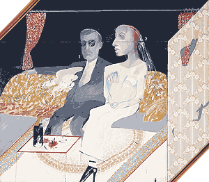
The second Marriage 1963---David Hockney


David HOCKNEYEnglish (active in USA), born 1937The second marriage 1963197.0 x 228.7 c


How does it made?
The painting is oil , gouache and collage on canvas.
This is a huge scale of the canvas work.
I think the artist painted the foreground and background first and then collage the couples which has drawn , curtain and wall paper.
Denotaion
The box like composition creates a critical context for the concept of marriage. The couple are depicted as if on show for the public and there is an uncomfortable self-consciousness about them. The groom’s face with glasses is quite dull. And the background is all black except the curtain. The bride’s face is mummy-like appearance without any emotional expression. The foreground is bright and colorful with mosaic carpet and glass desk in which putting the wine and glass cups, and red flowers. The composition for upper and lower parts with opposite color tones make an ironic mood in the picture.
Connotation
The text with” 1” beside the groom and the glass cup, and “2” next to the bride and another cup. What’s the connection between the figure and the cups? Does it simply present who drank which cup. I have no idea If any metophonic meaning behind it.
There is also a touch of humour and irony, as it has been suggested that the male figure is a self-portrait. The wedding should be supposed with delighteness and happiness. But for the second marriage, it’s definitely different mood especially for a man. It seems that they are forced to get married. Look at this picture, I would rather say it’s like they are attending a funeral. The marriage is the grave of love.

I shop therefore I am--Barbara Kruger


Barbara Kruger
Untitled (I shop therefore I am), 1987Photographic silkscreen/vinyl 111" by 113"


The work consists of a hand by an enlarged black and white photograph
The hand is holding a tag with a message “ I shop therefore I am” in white letters against a background of red. The tag is setting in the center of the image.This phrase is changed from the famous phrase from French philosopher Rene Descartes (1596 -1650) “I think therefore I am”.
The rectangle red block with text is overlaid set on the photograph. It attracts the viewer’s attention because the white text against the red background make it more obviously. And “I shop”, “I am” with a larger letters make stronger concept for the meaning of this design. The underneath with the black and white photograph is blurred, till can recognize that the light comes from the left side. The variation of different tones from the photograph make it not too dull and bored. The border of this image with red around the image. It is like a billboard if enlarge the size of this image. I found another design with the same image which image related to which printed on a shopping bag.

It’s also like a culture advertisement to revoke the consumer culture of the society.
The text contains criticism of the consumerism culture and implies the concept of the artist. Kruger has said that "I work with pictures and words because they have the ability to determine who we are and who we aren’t.
The hyper-consumerism of the late 20th century, the commodification of sign, and Kruger remakes the sign. Her design make me feel the flow of power about the criticism for commodification society. It’s ironic that a commercial- like image with the controversial text . It’s what she is giving the form of knowledge.

Naked Man --Banksy

Naked Man on the wall of a sexual health clinic 2006
The Mural is near Bristol City Council's Office, UK

The stencilled image shows a woman in her underwear standing behind a suited man leaning out of a window, the both are cropped from the window and a naked man hanging onto the ledge. It is a graffiti and stencil art with pop art. It’s on the street, the wall of a sexual health clinic in Bristol city,UK. This 2d drawing looks like 3 dimention one. The woman, the man and the naked man with a triangle composition. The red curtain by the white window, the background under the window is black. The man suit and the women’s underwear are gray and black. The naked man with skin color… those make a compatible composition and colors in the picture with the brown brick tiled wall.
The street art made by stencil with a striking and humorous image. The artist purposely painted it on the wall of a sexual health clinic to draw everyone’s eye. Of course, it caused a lot of argument between the public and city council. The controversy makes the public discussion to decide whether it should stay on the side of a building or be removed. However the graffiti still stay on it and more controversial discussion about the graffiti can be considered as an art or a vandalism. For such an interesting and fantastic art, I think it’s quite enjoyable to pass by it.

CY Twombly Untitle 1970


CY Twombly "Untitle" 1970.
Oil-based house paint and crayon on canvas, 13' 3 3/8" x 21' 1/8" (405 x 640.3 cm).


It’s a very big scale canvas. Despite the scale, people will think it’s a graffiti by an innocent kid. The composition of the lines scribble evenly all over the black canvas. The volume of the lines seem the fur from an animal.Further checking the details, the white fluid, continuous lines with horizontal direction writing goes smoothly and naturally. The only subjects on the canvas is the repetitive, overlaid lines. Some areas with smudges seems covering with a thin layer of gauze. The placement of the lines on the big field is energetic. I heard that Twombly made this work using an unusual technique: he sat on the shoulders of a friend, who shuttled back and forth along the length of the canvas, thus allowing the artist to draw the lines. lines.
I can feel the rhyme of lines with elegant melody seems to tell a story related to the artist his own. I am waiting someone can tell me the truth about the story. It’s a myth of the painting and shapes and forms imply the unique visual language which only the creator can understand and translate it.

2009年5月21日 星期四

Gender, the Body and the Gaze


One of art works in Judy Chicago's installation art The Dinner Party, called "O'Keeffe's dish". The flower looks like female's vergina.


(The Dinner Party is an installation artwork by feminist artis Judy Chicago depicting setting 39 mythical and historical famous women. It was produced from 1974 to 1979.)

The tribe in African nation of Niger

Gender, The body, and the Gaze

Sextuality is an issue related to the biology. Sex refers to the biological distinction between females and males. The two sexes have different primary sex characteristics. Mature females have wider hips, breasts to allow for pregnancy, giving birth and breast-feeding.
Matured males, on the other hand, develop more muscle in the upper body, and deeper voices. Many people understand little about sexuality. For most people, sex has been a culture taboo in Asian society. But sex-Industry(prostitute) is still busy with great sale.
People in western countries, they kiss in public, the Chinese kiss only in private. The Maoris rub noses.

Culture can define the two sexes very differently. In ancient time, women take care of children, cook and clean and men do the hunting, repairing and hunting. Cultures have in defining what is feminine and what is masculine. Some men in African tribes are proud of a display of dress-up, beauty, but most people in our society would think it as feminine.
Women struggled the equality with men. In general, women fare better in rich countries tha in poor countries. In Asian countries, most parents hope their first-born will be a boy rather than a girl. China has continued one child policy to limit China’s population growth. The rule has caused abortion, abandonment for female infants. It resulted the big difference of birth rate between male and female infants.

Talking about gender indentify, we knew some famous artists who are conflicting their sexuality. Marcel Duchamp was a cross-sexuality. Andy Warhol was a openly gay, Shigeyuki…., how about lesbian from the modern art history? Artists are especially emotional that’s why
they can create arts. Now free love is commonly supported by most of people. “ I do what I like, not what the people want me to do”. I feel more and more people talk about the gender issues from media(TV,radio, movie..). I am suspicious about some people are not a real gay but announce they are gay openly. I t has became a general issue, I don’t think we need to purposely mention about it.

During this contextual course, let me think of Georgia O’Keeffe(1887 ~1986 America) and Frida Kahlo(1907~1954 Mexica) . They both are artists who like express sexuality(woman’s body, organ) by metaphoric way into their drawings. Their powerful, passionate painting style imply an extraordinary mythic atmosphere.
I will do further research about their personality ,backgrounds and art –style.


Ref:

"Sociology " by John J. Macionis

"Moderism about the role of women and gender in modern art"

2009年5月20日 星期三

HOPE

Obey Manifesto
The Obey campaign can be explained as an experiment in Phenomenology. The first aim of Phenomenology is to reawaken a sense of wonder about one's environment. The Obey campaign attempts to stimulate curiosity and bring people to question both the campaign and their relationship with their surroundings. Because people are not used to seeing advertisements or propaganda for which the motive is not obvious, frequent and novel encounters with Obey propaganda provoke thought and possible frustration, nevertheless revitalizing the viewer's perception and attention to detail. The medium is the message.

http://www.thegiant.org/wiki/index.php/Obey_Giant The "Hope" poster was produced during the US presidential election in 2008, by artist Shepard Fairey in support of the Obama campaign. One day, Shepard found a photo of Obama and illustrated it into a image. Soon he received the approval from the Obana campaign and was asked to produce the text highlighting the ideology of hope. "Hope" and "Progress" both were commonly used throughout Obama campaign . The "Hope" poster soon became used by the campain. And easily spreaded as a symbol of Obama compaign (Democratic Party)
During the presidential election, Obama was himself a symbol of change, and representing hope to Americas. It satisfied the publice who are supporters to Obama. Meanwhile, It achieved the reputation of Obey campaign and the artist's wealth.

http://www.obey.com/

http://www.obeygiant.com/


Capitalism, Commodification and Andy Warhol


Capitalism, Commodification, and Pop Art

Talking about capitalism, it’s a system which is economic, social and political. The system should trace further to 16~17 century from Europe. The system in which wealth and the means of producing wealth, are privately own. Through capitalism, the land, labour and capital are operated and trades under free market for the purpose of income by supply good, commodity. The opposite system of capitalism is socialism evern more communism. I am not concerned about the issue like which system is better between capitalism and socialism. In 20 century, the most symbolic country of capitalism is America. During the period of 1960, a capital society made every products as a target on making money. A mass consumer culture spreaded widely. The consumerism was gladly accepted as a basic value by the free world. Under the commodication circumstances, Andy Warhol’s extraordinary concepts and artistic repetitive method drew public attention to his unsual talent. He was a advertisement illustrator in the beginning. His first exhibition about the pictures of Campbell’s soup cans in Jul and Aug., 1962. A mixture of painting, silkscreen and a stamp process. Andy Warlhol’s art works reflected its social background, maybe that’s because he had ever studied sociology. Campbell’s soups, Coca Cola......which are common and very important to everyday life for everyone. Taiwan was under American protection and a member of the democracy at the time. And it naturally wa affected by American culture including POP trends. Coca Cola is a symbol of American dream during my childhood. I remember when I was sick I could get a bottle of Coca Cola for a special treatment from my mum. Now I can understand why I could have the coke, it’s a
kind of metal healing for a kid with sickness.

Later he continuously created a series artworks related to super stars, singer (Marilyn Monroe, Liz tayler , Elvis Presley…), and politician like Mao Zedong (a leader of People’s Republic of China). He earned the success of his reputation and wealth. He was called “ The POP of POP”.
During the time of 1960, Billy Apple (1935, Barrie Bates in Auckland, New Zealand) also a member of POP artists.
He collaborated with Andy Warhol and the other POP artists. His art life from POP period and from 1970 he involved into the conceptual art in N.Y. Billy changed his name from Barrie Bates into Billy Apple in 1962. I was impressed by his art work “SOLD”(The giving as an art political statement) in 1981.
The gallery poster showed “Art for Sale”. When people entered the gallery the wall were empty , there were not pictures at all, but sales-stickers. because the art all sold out. Only the sold stickers showed on the wall.
But they didn't look much likeThe biggest sales-ticket cost $3,000 and the prints, which after all were smaller and on paper and weren't unique items, cost only $300.

Is it a joke? A gallery where everyone supposed there are full of art works. Now There is no other content, no pictures except “SOLD” the statement in a gallery. "SOLD" makde it more obvious about the relationship between the gallery, the artist and the clients. “SOLD” reflected the issue about the money of art , the business of art.
Sometimes I feel very confused about the conceptual art and the artist’s controversial art method. Conceptual art can be seen as the artist’s philosophy presentation.
Ref: "Pop Art" by Klaus Honnef
www.wikipedia.org